
The initial moments spent on a new web page are crucial, offering just a few seconds to make a lasting impression. A multitude of factors can contribute with this, including color perception, design layout, and content. In this guide, we’ll break down some key considerations for crafting an effective web design.
Create a visual language that’s unique and desirable
Among the critical aspects of web design is the creation of compelling and relevant content. The content and graphics play an important role in shaping the user’s perception of your company and the value they derive from your services. Ideally, the content should surpass user expectations.
Web Navigation
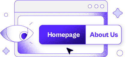
When done right, the navigation will tell you implicitly where to begin and what your options are, making the hierachy visible. In the “real” world, we often get frustated when we cannot find something, same happens in the digital world, think of it as an emergency evacuation from a building, you don’t have time to think, you’ll need to act. By creating an easy navigation for the users, you asure they will have a good experience because they’ll be able to find what they’re looking for in a time matter.
Freedom to choose
Often times the users try to find content/resources on their own, when they can’t, they get frustrated and try to find alternative solutions. Always give the user the option to either go back, to use breadcrumbs, use a search bar, or ask for help if needed.
Do not reinvent the wheel but do.
“Users spend most of their time on other sites. This means that users prefer your site to work the same way as all the other sites they already know.”
By Jakob Nielsen
Take note of the standard practices observed online, like the search bars prominently displayed on search engines such as Google, Yahoo, and Bing against a white backdrop. E-commerce websites routinely position the ‘Cart’ icon at the top right corner, and a uniform blue color characterizes text links throughout the web. Similarly, the ‘Send’ button on a phone screen is typically situated in the bottom right corner. Straying from these established conventions may lead to confusion and frustration, potentially resulting in the loss of a customer.
While it’s important to keep certain things consistent from what’s common, that’s where innovation comes from. It’s our job to create layouts that can easily impact your audience but maintening the
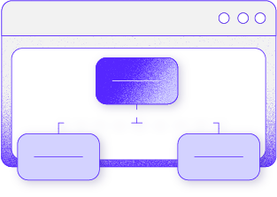
Nobody likes to get lost
Every page needs a name, should be right in place and be prominent… It should be easily identify by the audience, think about it as the”You’re here” map in a mall, on a web, this is easily acomplished by highlighting the page you’re on, either with a different color or with a background.
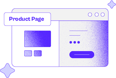
Shortcuts
Create shortcuts that could be potentially used for the mayority of users, per example: blogs, site registration, best sellers, software updates, shopping cart, etc. The audience is always looking to get the information they want as quick as possible, they don’t like to hunt.
Responsive design
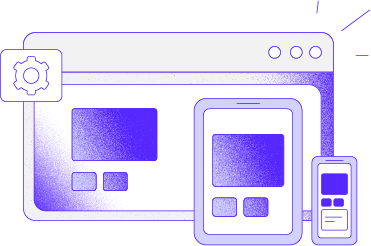
Your website will be used in multiple devices and you need to be prepared for it. The website must never be distorted beyond recognition or lose important features to adapt to different devices. This is where good design and development will play an important role.
Are you looking for creating an impactful, reliable and trustworthy website?
Reach out to us and we’ll create amazing together!